
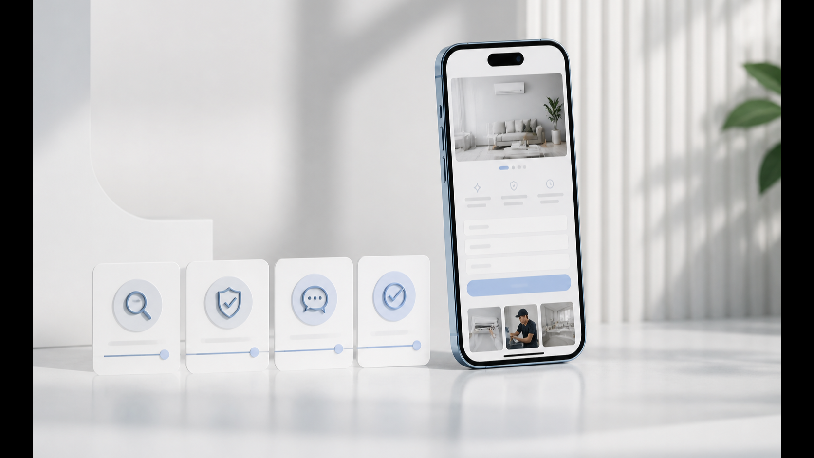
A service-business website can look convincing on a large screen and still lose serious prospects on a phone.
Investigate both a single blocking fault and a chain of smaller obstacles: the headline may wrap awkwardly, navigation may take too much space, proof may appear too late, a button may be difficult to tap, a form may ask for too much, or the page may move while it loads. Observe the actual journey before deciding which issue prevents a suitable visitor from progressing.
On mobile, that friction is concentrated. There is less visible space, less tolerance for competing information and less room for an unclear hierarchy. A person may be comparing providers between meetings, checking a recommendation on the move or revisiting a service after seeing an email. The website has to establish relevance and trust without relying on the space available on desktop.
Mobile website conversion is therefore not a separate design concern. It is part of the commercial journey.
Mobile is not a smaller version of desktop
Responsive design does more than reduce the width of a page. It changes how information is prioritised, grouped and operated.
web.dev’s responsive-design guidance explains that layouts should adapt to different screen sizes and modes of interaction. A multi-column desktop section may need to become a single, deliberate sequence on a phone. Images should fit the viewport, typography should remain readable and the page should not force horizontal scrolling.
That change in sequence matters commercially. On desktop, a prospect may see the headline, proof and call to action at once. On mobile, those elements arrive one after another. If a decorative image appears before the value proposition, or a long introduction delays the evidence, the visitor may leave before reaching the information that would have justified an enquiry.
The question is not simply, “Does the page fit?” It is, “Does the mobile sequence help the visitor decide?”
The first screen has to establish relevance
A mobile hero has limited space. It should use that space to answer three questions quickly:
- Is this service for a business like mine?
- What commercial problem does it solve?
- What is the sensible next step?
Large branding, oversized navigation and vague slogans can consume the first screen without answering any of them. The result may look polished while leaving the visitor unsure what the business actually does.
A strong mobile opening normally needs:
- A specific headline tied to a business outcome or problem.
- A short explanation that adds useful context.
- One clear primary action.
- A concise trust cue where it can be substantiated.
The aim is not to fit the entire sales argument above the fold. It is to create enough clarity for the visitor to continue.
Information order becomes part of the sales process
Mobile pages reveal weak content architecture because every section must earn its place in a vertical flow.
For an established service business, a useful sequence is often:
- Relevance: name the problem and the audience.
- Consequence: explain what the current problem is costing or preventing.
- Solution: show what the service changes.
- Proof: demonstrate capability with work, process or credible evidence.
- Risk reduction: explain timing, fit and what happens next.
- Action: provide the appropriate route to enquire, apply or diagnose.
This order does not have to be rigid, but it should be intentional. If five service cards, a large visual and a general company statement appear before the first meaningful proof, the visitor is forced to assemble the proposition alone.
The homepage conversion mistakes guide explains how competing messages and delayed proof weaken the wider journey. On mobile, those weaknesses become harder to ignore because only a small part of the page is visible at any moment.
Navigation should reduce decisions, not reproduce the sitemap
Mobile navigation fails when it treats every page as equally important.
A crowded menu can turn the first interaction into an information-retrieval exercise. Long labels wrap, nested menus become difficult to scan and several visually equal calls to action compete for attention.
The main navigation should help a new visitor reach the commercially important destinations: services, relevant work, process or about information, and the primary next step. Secondary resources can remain available without dominating the menu.
Check that the navigation:
- Opens and closes reliably.
- Uses readable labels rather than internal terminology.
- Keeps important destinations near the top.
- Does not cover essential page content without an obvious close control.
- Returns keyboard focus appropriately.
- Avoids several competing primary buttons.
Navigation is not a directory of everything the business has produced. It is a decision aid.
Touch targets and spacing affect whether actions are usable
A button can be visually present and still be difficult to use.
WCAG 2.2’s minimum target-size guidance specifies at least 24 by 24 CSS pixels, with exceptions including sufficient spacing, inline links and equivalent controls. W3C also recommends considering larger targets for important controls. This single criterion is not a complete accessibility assessment.
For commercial pages, the practical implications are straightforward:
- Give buttons enough height and internal padding.
- Leave space between adjacent actions.
- Do not place small text links tightly together.
- Make the entire intended control clickable, not only the label.
- Keep key actions clear of browser controls and sticky overlays.
These decisions help people with accessibility needs, but they also improve ordinary touchscreen use. A prospect should not have to zoom, aim carefully or correct an accidental tap to contact the business.
Forms must match the commitment being requested
A mobile form turns every unnecessary field into visible effort.
For an initial enquiry, ask only for information that genuinely changes the next step. If the business needs a detailed application, explain why the information is required and divide the form into manageable stages. Preserve progress where practical, use appropriate input types and make validation messages specific.
Review whether the form:
- Uses a single-column layout.
- Provides visible labels rather than relying only on placeholders.
- Opens the correct mobile keyboard for email and telephone fields.
- Explains errors next to the relevant field.
- Preserves entered information after an error.
- Confirms that submission has succeeded.
- Sets expectations for the response.
The commercial journey continues after the submit button. A broken confirmation, missing notification or generic thank-you page can undermine the trust created by the rest of the website.
Performance changes how credible the page feels
Mobile visitors may be using a slower connection or a less powerful device than the one used to approve the design. Large images, excessive scripts, animation libraries and third-party widgets can delay the moment when the page becomes useful.
Google’s Core Web Vitals guidance covers loading performance, responsiveness and visual stability. The metrics are Largest Contentful Paint, Interaction to Next Paint and Cumulative Layout Shift, with good thresholds of no more than 2.5 seconds, 200 milliseconds and 0.1 respectively. Assess the 75th percentile of real page visits, separating mobile and desktop; a single fast test run cannot establish that visitors consistently receive that experience.
Those measurements should not be treated as a substitute for commercial judgement. They help identify whether the main content appears promptly, interactions respond and elements remain stable. A page can meet a lab score and still have confusing copy; it can also contain strong copy that prospects never reach because the experience is slow or unstable.
Measure both field data and the actual journey. web.dev’s Web Vitals measurement guidance distinguishes real-user field measurement from controlled laboratory testing. Device, network and interaction conditions differ, so lab results help diagnose problems without replacing field evidence.
Mobile content should not become the incomplete version
Removing important content can make a page look cleaner while weakening its ability to persuade and rank.
Google’s mobile-first guidance explains its use of mobile content for indexing and ranking. It recommends responsive design and warns against making primary content dependent on user interaction before it can be loaded or discovered.
The mobile page should preserve the substance of the desktop experience:
- The same clear proposition.
- Meaningful headings.
- Relevant proof.
- Essential service information.
- Descriptive image text where appropriate.
- Structured data and metadata.
- Crawlable internal links.
The solution to a crowded mobile page is better hierarchy, not hiding the evidence a serious buyer needs.
Test the journey on real devices
Desktop resizing and browser emulation are useful, but they do not replace physical-device checks.
Test important pages on at least one current iPhone and one Android device where possible. Use mobile data as well as Wi-Fi. Rotate the device. Increase text size. Open and close navigation. Tap every primary action. Complete every form. Check the confirmation and notification. Follow internal links and return using the browser controls.
Pay particular attention to:
- Horizontal overflow.
- Headings that create awkward single-word lines.
- Sticky bars that obscure content.
- Pop-ups that are difficult to dismiss.
- Images that dominate the screen without adding meaning.
- Layout shifts around buttons or forms.
- Links or controls placed too close together.
- Text contrast under real brightness conditions.
The goal is not to make every device look identical. It is to preserve clarity, usability and the commercial path.
Review mobile as a complete conversion system
A high-performing mobile website connects content, design, speed and follow-up. Improving one isolated screen while leaving the rest of the journey broken will not produce a reliable enquiry system.
Start with these questions:
- Can a new visitor explain what the business does after the first screen?
- Does the order of sections answer the next likely question?
- Is proof visible before the main commitment request?
- Are navigation, buttons and forms comfortable to use by touch?
- Does the page load and respond without disruptive movement?
- Does the mobile version preserve the important content and links?
- Does the enquiry route complete successfully from start to confirmation?
If the problems extend across positioning, page structure, mobile experience, forms and follow-up, review the £297 Acquisition Works Audit. This five-working-day diagnostic produces prioritised actions and an implementation roadmap before you commit to a rebuild. If that diagnosis establishes that the foundation needs replacing, our website design and rebuild service describes the implementation route.
For a lower-commitment self-review first, use the Business Website Conversion Checklist across the homepage and key service pages.