
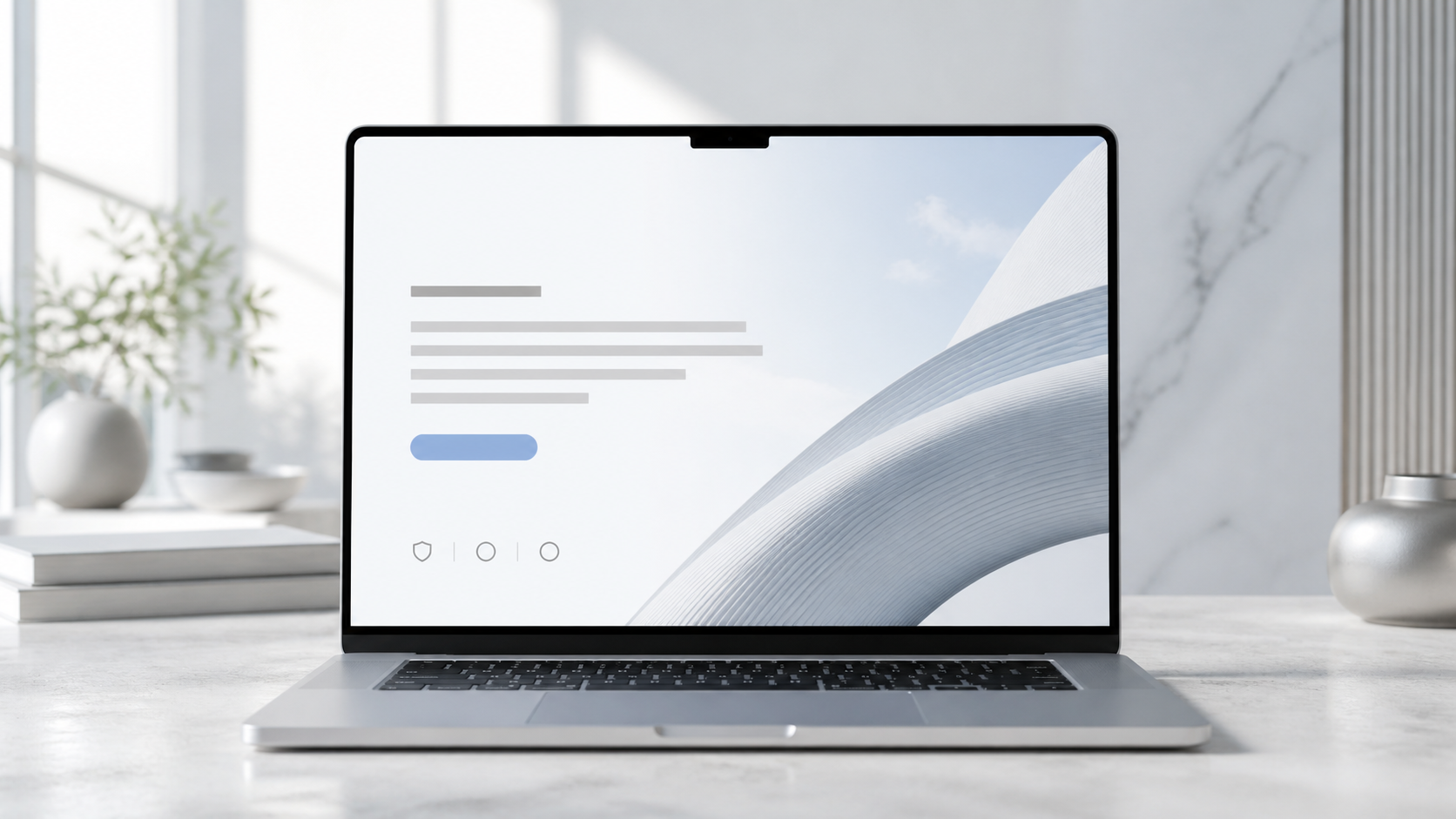
The first screen of a service website has one job: help the right visitor decide that continuing is worthwhile.
It does not need to explain the whole company. It needs to establish relevance, orientation and momentum. When the headline is vague, the image dominates the message or several calls to action compete, the visitor has to work before the business has earned that effort.
“Above the fold” is not a fixed pixel height. Screens, browser settings and devices vary. Treat it as the first coherent view rather than a rigid design box.
State what the business actually does
The main heading should describe the offer or the problem solved in language a buyer recognises. A visitor should not need to interpret an internal slogan to determine whether the company provides commercial websites, accountancy, legal support or property maintenance.
Distinctive wording can still be precise. “Your website is where the growth problem shows up” creates interest only when the supporting line immediately explains that the company diagnoses and rebuilds websites, conversion journeys and connected business systems.
Use one H1 for the primary page topic, then create a logical heading hierarchy below it. The Web Content Accessibility Guidelines require information and relationships conveyed visually to be programmatically determinable, which supports both accessibility and sound page structure.
Identify the customer
Strong homepage copy lets the intended buyer recognise themselves. The audience might be established service businesses losing enquiries, founders launching a first commercial platform or professional firms replacing fragmented processes.
This does not require a long list of industries. A short qualifier can signal business stage, problem or buying situation. Specificity improves relevance while helping unsuitable prospects self-select out.
If the opening tries to speak to every possible organisation, the promise usually becomes generic. The right visitor should be able to say, “This is built for a business like mine.”
Make the outcome concrete
Service buyers are rarely purchasing a website, CRM or automation in isolation. They are trying to improve how demand becomes revenue: clearer positioning, better enquiries, consistent follow-up, less manual friction or a platform that can support growth.
Describe that movement without guaranteeing results. “A commercial website and follow-up system designed to turn qualified interest into a managed sales journey” is more useful than “revolutionary digital experiences”.
Do not use invented percentages or unverified client logos to create urgency. If a number is illustrative, label it. If a result belongs to a case study, provide enough context for the reader to understand what changed.
Present one primary action
The first screen should have a dominant next step. For a high-consideration service, that may be a project discussion, application or diagnostic. The button label should describe what happens rather than say only “Submit” or “Learn more”.
The GOV.UK Design System’s button guidance recommends using buttons to help users carry out an action and using clear labels that describe it. The underlying principle applies to commercial sites: the interaction should match the promise.
A secondary route can support visitors who are not ready. On Acquisition Works, the Business Website Conversion Checklist is a practical lower-commitment option. It should not visually overpower the primary commercial route.
Add a credible reason to continue
The first view can include a restrained trust signal: a concise proof statement, relevant accreditation, named specialism or link to substantive work. Avoid a dense logo strip or a row of unsupported statistics that competes with the proposition.
The strongest proof depends on the buyer’s perceived risk. A regulated profession may need credentials and governance. A design partner needs excellent work. A systems consultancy needs to show thinking, implementation detail and accountable delivery.
Proof can sit immediately below the hero if forcing it into the opening weakens the message. The objective is not to fill empty space; it is to create a confident reading sequence.
Use imagery that supports the proposition
A hero image should clarify the category, demonstrate the work or establish an appropriate emotional setting. Generic abstract technology graphics often create the appearance of sophistication while explaining nothing.
For a consultancy, a clean project interface, considered environmental photograph or strong typographic composition may be enough. For a portfolio-led firm, a high-quality view of the work can provide immediate evidence. Decorative imagery should never make text harder to read.
Test contrast in all responsive states. WCAG 2.2 includes minimum contrast criteria and requirements for text alternatives where images convey information. These standards protect usability while keeping the visual system disciplined.
Preserve breathing room without wasting the screen
Premium spacing is deliberate, not merely large. The heading, supporting sentence and action should feel connected as one decision unit. Excessive blank space can push the proof and context out of view without improving comprehension.
Use a readable line length, clear hierarchy and enough separation to distinguish elements. Avoid tiny uppercase text, extreme letter spacing and over-condensed type when those choices reduce legibility.
On mobile, do not simply stack a desktop hero and retain its oversized heights. Recompose it for the narrower screen, keep the action visible and remove decorative elements that interrupt the sequence.
Keep the opening fast and stable
Large video, unoptimised images, third-party scripts and complex animation can delay the moment when the message becomes usable. That weakens the exact first impression the hero is meant to create.
Google’s Core Web Vitals guidance covers loading performance, interaction responsiveness and visual stability. Its mobile-first indexing documentation also explains why the mobile version must contain the same important content as desktop.
Optimise the primary visual, reserve its layout dimensions and delay non-essential code. Motion should support orientation, not hold the message hostage.
Connect the hero to the rest of the journey
The promise in the first screen creates an obligation for the page below. If the hero claims to improve qualified enquiries, the next sections should explain the problem, method, evidence, services and process in that order.
Do not switch language halfway down the page or route every button to a generic contact form. Maintain the same commercial idea through service pages, case studies, forms, confirmation and follow-up.
The Website Builds page shows how Acquisition Works approaches the wider platform rather than treating the hero as an isolated design exercise.
Review it with five questions
Before launch, show only the first screen to someone who has not seen the project. Ask:
- What does this company do?
- Who is it for?
- What result is being offered?
- Why might you trust it?
- What would you click next?
If the answers are inconsistent, revise the message before adding effects. The best hero is not the busiest or most fashionable. It is the clearest high-value introduction to the commercial journey.
Repeat the test at common mobile and desktop widths, with the navigation both open and closed. Check that browser zoom, longer button labels and validation messages do not break the layout. A hero that works only in the designer’s ideal screenshot is not production-ready; the real standard is whether it remains understandable in ordinary use.
If your opening message and enquiry journey are not giving buyers a clear next step, start with the £297 Acquisition Audit. The five-working-day diagnostic reviews the website-to-enquiry journey, follow-up, CRM and relevant workflows, then provides prioritised actions and an implementation roadmap. For a first self-review, the Business Website Conversion Checklist offers a lower-commitment starting point.