
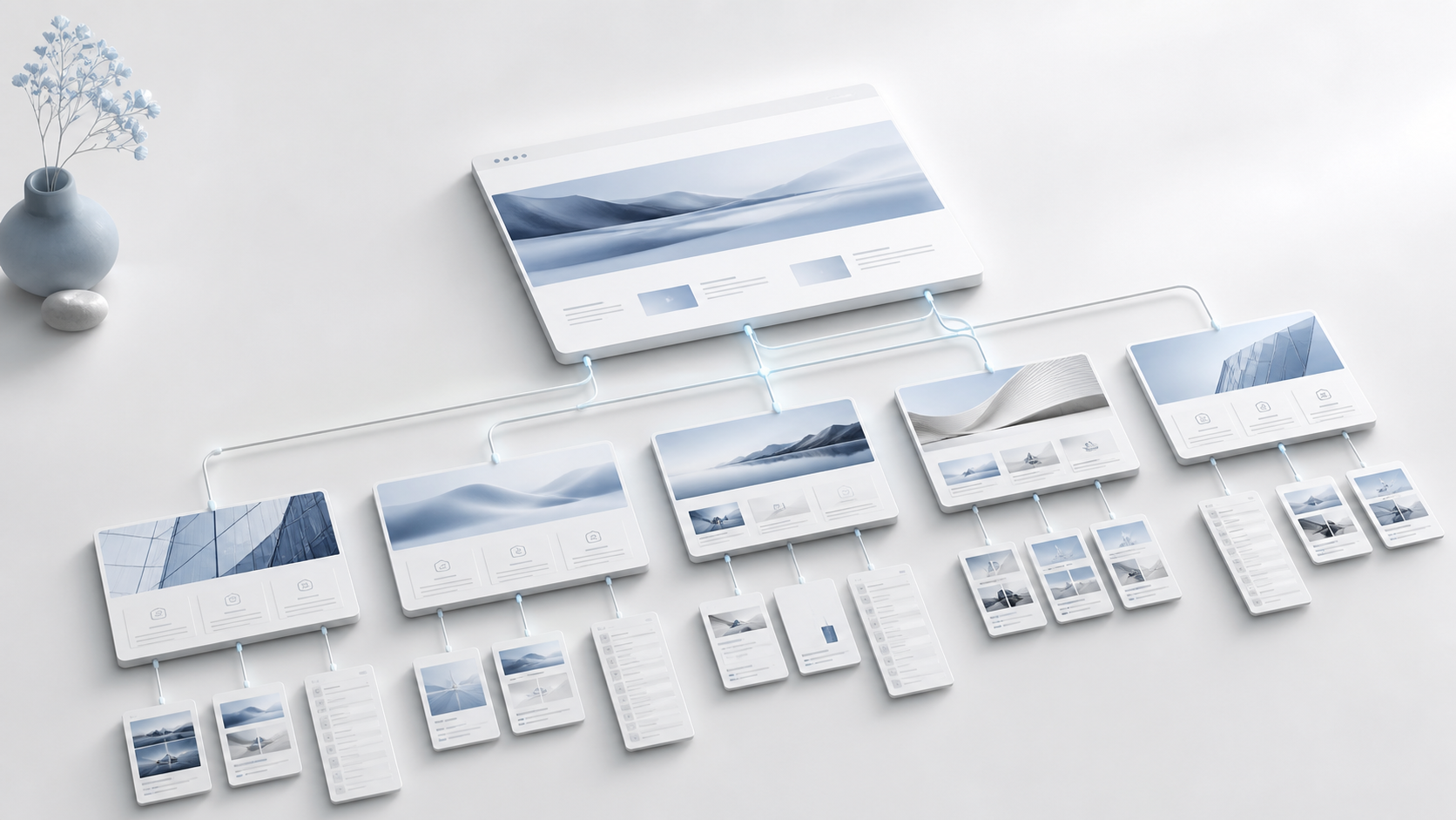
A strong business website structure is organised around the questions a customer must resolve before taking action. It should help a suitable prospect understand the offer, recognise whether it fits, verify the evidence, see how delivery works and choose the right next step.
This is different from reproducing an internal organisation chart. Visitors do not arrive thinking about departments, reporting lines or every capability the business could provide. They arrive with a problem, a desired outcome and uncertainty.
The practical goal is a small set of purposeful pages connected by clear navigation and contextual links. Each page should own one commercial job and move the visitor towards the next relevant decision.
Begin with customer decisions, not a page list
Before choosing navigation labels, write the decisions the website must support.
For an established service business, they usually include:
- Is this business relevant to my situation?
- Does it understand the problem I am trying to solve?
- What service or route is appropriate?
- Can I trust the people, process and evidence?
- What will happen if I make contact?
- Is there a lower-commitment way to learn more?
These decisions become the architecture brief. A page exists because it resolves one or more of them, not because a conventional template included that page.
The World Wide Web Consortium’s supplemental guidance on clear site hierarchy recommends organising content into logical, cohesive sections and building the main navigation from important categories. This is additional cognitive-accessibility guidance, not a standalone WCAG conformance requirement. Applied to a commercial site, it gives customers a more predictable route to the information they need.
Give the homepage one clear responsibility
The homepage should orient, qualify and route. It does not need to contain every detail or close every sale.
Its first sections should establish:
- The commercial problem the business addresses.
- The audience or situation it is designed for.
- The connected outcome or service category.
- A credible reason to continue.
- One primary next step and a suitable lower-commitment route.
Then introduce the service ecosystem, proof, process and decision paths in a deliberate order. Avoid treating the homepage as a collage of unrelated campaign blocks.
Our guide to service website content above the fold explains how the first screen can reduce uncertainty without trying to communicate the entire business.
Build focused service pages around buying intent
Each major service needs a page when it represents a distinct customer problem, scope or buying decision.
A useful service page explains:
- The situation that makes the service relevant.
- The outcome the work is designed to support.
- What is included and excluded.
- How the process works.
- What evidence is available.
- The expected next action.
Do not split services purely to create more pages. If two pages answer the same intent with slightly different wording, they compete for attention and search relevance. Conversely, one broad “Services” page may force visitors to decode several materially different offers.
Acquisition Works separates Website Builds from the Acquisition System because the buying questions differ. One concerns the public commercial website; the other concerns the connected infrastructure that moves enquiries through follow-up and business operations.
Use proof where the decision needs it
A single portfolio page is useful, but proof should not be isolated there.
Place relevant evidence beside the claim it supports:
- A service page can include a directly related case-study section.
- A process section can show a real deliverable or implementation stage.
- An actual conversion-result claim needs verified evidence. A clearly labelled illustrative model can explain an approach, but cannot substantiate a real client outcome.
- A call to action can be followed by timing, scope and risk-reversal information.
Early-stage businesses should be explicit about founder-owned work. Process evidence, screenshots, working systems and transparent limitations are stronger than invented client outcomes.
Our guide to building proof into a B2B website provides a practical framework for using evidence without overstating it.
Make process and expectations easy to find
Serious buyers want to know what happens after contact. If the process is hidden, the call to action carries unnecessary uncertainty.
Create a process section or page that explains the sequence in plain language: diagnosis, scope, build, review, launch and ongoing improvement where relevant. State what the customer must provide, the typical factors that affect timing, and how decisions are approved.
This does not require publishing an inflexible promise. It requires showing that delivery is controlled and accountable.
Treat insight content as a decision-support layer
Articles should not sit in a disconnected blog archive. They should answer questions that arise before, during and after a buying decision.
Organise content into commercial clusters such as:
- Website performance and conversion.
- Offer and customer-journey clarity.
- CRM, follow-up and automation.
- Starting and structuring a new business.
- Measurement and optimisation.
Every article should link to the service or diagnostic route that matches its reader’s readiness. Service pages should also link back to the most useful guides where they help a visitor evaluate the decision.
Google Search Central recommends using crawlable links, descriptive anchor text and links from other pages to every important page in its official link guidance. Good internal linking helps search systems discover relationships, but it also helps people continue without returning to the main navigation.
Design navigation for recognition
Navigation labels should use words the customer understands. Internal names, clever phrases and broad labels such as “Solutions” can hide meaning.
For a compact consultancy website, primary navigation may include:
- Services.
- Website Builds.
- Case Studies.
- Insights.
- A diagnostic or application action.
Not every page needs top-level placement. Legal pages, secondary resources, policies and lower-priority company information can sit in the footer or contextual routes.
W3C’s designing for accessibility guidance recommends clear, consistent navigation, orientation cues and more than one method of finding content where appropriate. Consistency reduces the effort required to build a mental model of the site.
Create a clear page hierarchy
The same decision-led principle applies inside each page.
Use one clear H1, followed by H2 sections that correspond to the visitor’s questions. Keep related paragraphs together, use meaningful headings and show changes in purpose through whitespace and visual hierarchy.
W3C’s writing accessibility guidance notes that headings should convey meaning and structure. A page that scans well is easier to evaluate for everyone, including time-poor decision-makers.
A service page might follow this sequence:
- Problem and outcome.
- Who the service is for.
- What is included.
- Evidence and examples.
- Process and timing.
- Questions and risk.
- Next action.
The sequence can change, but each section should prepare the next decision rather than repeat the headline.
Provide different routes for different readiness
Not every visitor is ready to apply or buy. A website still needs a commercially useful path for them.
Use a restrained hierarchy:
- Primary action: discuss, apply for or buy the relevant service.
- Diagnostic action: purchase an audit when the cause or scope is unclear.
- Low-commitment action: use a genuinely useful checklist or guide.
Avoid presenting all three with equal weight in every section. Choose the primary action for the page’s intent and introduce alternatives where hesitation is most likely.
Map the complete journey before design begins
A sitemap is not enough. Add the operational route after each call to action.
For every important page, record:
- Entry source and likely expectation.
- Primary action.
- Form or checkout destination.
- Confirmation state.
- Internal notification.
- CRM or pipeline record.
- Owner and response rule.
- Measurement event.
This exposes gaps that visual wireframes miss. A beautifully structured website can still fail if a form creates no accountable next step.
Test structure with real tasks
Give a reviewer a realistic task without explaining the navigation. For example: “Find the service for rebuilding an established company’s website, understand what is included and identify the next step.”
Observe where they hesitate, return or choose the wrong path. Test on mobile as well as desktop and include keyboard navigation. Do not ask only whether the design looks clear; ask whether the person can complete the decision.
Then inspect analytics and search data after launch. Pages with repeated backtracking, abandoned form starts or irrelevant search entrances may indicate structural confusion. Use evidence to refine the route rather than adding more navigation items reflexively.
A practical structure for an established service business
A concise starting architecture is:
- Homepage: orient, qualify and route.
- Services overview: show the connected ecosystem.
- Focused service pages: answer distinct buying intents.
- Case studies: provide verifiable evidence and implementation detail.
- Process: explain delivery and responsibilities.
- Insights: answer commercial questions and support search discovery.
- Contact or application: collect only the information needed for the next decision.
- Lead capture: offer a useful lower-commitment resource.
- Legal and privacy pages: make commercial and data practices accessible.
The exact number of pages is less important than the clarity of their jobs and connections.
If your current website has grown into duplicated services, unclear navigation and disconnected calls to action, diagnose the structure before committing to a rebuild. The £297 Acquisition Audit is a five-working-day diagnostic of the website-to-enquiry journey, follow-up, CRM and relevant workflows. You receive prioritised actions and an implementation roadmap, so the next decision is based on the actual gaps. Design and implementation are scoped separately; the audit does not presume that a full rebuild is necessary.